


Berndhaut Smilde is a unique artist who creates in door clouds, a truly original idea! He will be exhibiting at the Saatchi Gallery from 25th April, so it's definitley worth a visit! Pure simplicity.


 George Osborne should have included this in his budget. Looooove this! Found it on StumbleUpon, so I'm heading down to a DIY store on Saturday so I can make one of these for myself. Marvellousssssss...will keep you posted on the end result.


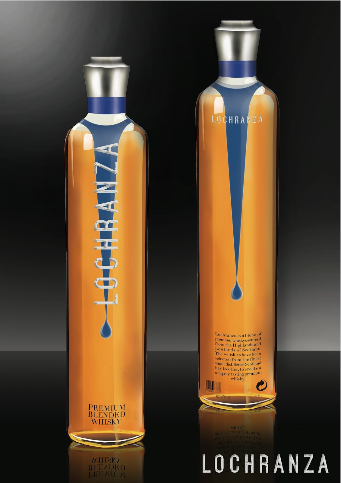 Ben Braithwaite is a graphic design student in his final year, his latest project was to design a whisky bottle. The concept of his Whisky brand called Lochranza was that it is "elegant, smooth, feminine, simple design with no traditional labels putting it right into the 21st Century, appealing to an international female market."


 Two weekends ago I made an attempt to go to the Tate Modern to see the Yayoi Kusama exhibition with Rach, Ben and Archie. Probably not the best idea to go to a busy art gallery when you have only had 2 hours sleep...We spent a good half hour sitting on the floor looking at The Unilever Series by Tacita Dean in the Turbine Hall (shown above). It's a silent film projected onto a white monolith standing 13 metres tall, the idea is to celebrate the original techniques of analogue film-making. I don't really see why a film showing a pile of dirt, stairs and some walls with the occasional tree thrown in there is celebrating the art of analaogue film...but maybe that's why I'm not a film maker. Needless to say we didn't make it to the Kusama exhibition but headed to a pub instead. Bloody Mary's and Monopoly Deal.